Primary Data
Data collected from any firsthand experience for an explicit use or purpose is known as Primary Data
Secondary data
Data collected by any third party for a different purpose other than the user is known as Secondary Data
Presentation of Data
After collecting data it is important to present it in a meaningful manner. There are many ways to present data.
1. Ungrouped Data
a. Raw Data- If there is no change in the data and it is in the same form as it is collected then it is said to be raw data.
Example
The marks obtained by 10 students in a Sanskrit test are
55 36 95 73 60 42 25 78 75 62
Range- The difference between the highest and the lowest number of data is called Range.
b. Frequency Distribution- When the number of items is large then we can convert it into the tabular form which is called a Frequency Distribution Table.
Frequency is the number of times the item comes in the table.
2. Grouped Data
To present the very large number of items in a data we use grouped distribution table.

a. Class Interval – The group used to classify the data is called the class interval i.e. 20 – 30, 30 – 40.
b. Upper Limit - In each class interval, the greatest number is the upper-class limit.
c. Lower Limit – In each class interval, the smallest number is the lower class limit.
d. Class Size - It is the difference between the upper limit and the lower limit i.e. 10.
e. Class Mark – The midpoint of each class interval is the class mark.

Grouped data could be of two types as below:-
Inclusive or discontinuous Frequency Distribution – If the upper limit of one class is different from the lower limit next class then it is said to be an Inclusive or discontinuous Frequency Distribution.
Exclusive or continuous Frequency Distribution – If the upper limit of one class is the same as the lower limit of the next class then it is said to be exclusive or continuous Frequency Distribution
Graphical Representation of Data
As you know a picture is better than thousand words so represent data in an easier way is to represent it graphically. Some of the methods of representing the data graphically are
1. Bar Graph
It is the easiest way to represent the data in the form of rectangular bars so it is called Bar graph.
The thickness of each bar should be the same.
The space between in bar should also be same.
The height of the bar should be according to the numerical data to be represented.
Example
Represent the average monthly rainfall of Nepal for the first six months in the year 2014.
| Month | Jan | Feb | Mar | Apr | May | Jun |
| Average rainfall | 45 | 65 | 40 | 60 | 75 | 30 |
Solution
On the x-axis mark the name of the months.
On the y-axis mark the class interval which we have chosen.
Then mark the average rainfall respective to the name of the month by the vertical bars.
The bars could be of any width but should be same.
This is the required bar graph.

2. Histogram
It is like the Bar graph only but it is used in case of a continuous class interval.
Example
Draw the histogram of the following frequency distribution.
| Daily earnings (in Rs) | 700 – 750 | 750 – 800 | 800 – 850 | 850 – 900 | 900 – 950 | 950 – 1000 |
| No. of stores | 6 | 9 | 2 | 7 | 11 | 5 |
Solution
Mark the daily earnings on the x-axis.
Mark the no. of stores on the y-axis.
As the scale is starting from 700 so we will mark the zigzag to show the break.
Mark the daily earnings through the vertical bars.

3. Frequency Polygon
To draw the frequency polygon
First, we need to draw a histogram
Then join the midpoint of the top of the bars a line segment and the figure so obtained is required frequency polygon.
The midpoint of the first bar is to be joined with the midpoint of the imaginary interval of the x-axis
The midpoint of the last bar is to be joined with the midpoint of the next interval of the x-axis.

If we need to draw the frequency polygon without drawing the histogram then first we need to calculate the class mark of each interval and these points will make the frequency polygon.
Example
Draw the frequency polygon of a city in which the following weekly observations were made in a study on the cost of living index without histogram.

Step 1: First of all we need to calculate the class mark of each class interval.
Step 2: Take the suitable scale and represent the class marks on the x-axis.
Step 3: Take the suitable scale and represent the frequency distribution on the y-axis.
Step 4: To complete the frequency polygon we will join it with the x-axis before the first class and after the last interval.
Step 5: Now plot the respective points and join to make the frequency polygon.

Measures of Central Tendency
To make all the study of data useful, we need to use measures of central tendencies. Some of the tendencies are
1. Mean
The mean is the average of the number of observations. It is calculated by dividing the sum of the values of the observations by the total number of observations.
It is represented by x bar or .
.
The meanof n values x1, x2, x3, ...... xn is given by

Mean of Grouped Data (Without Class Interval)
If the data is organized in such a way that the frequency is given but there is no class interval then we can calculate the mean by

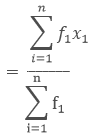
where, x1, x2, x3,...... xn are the observations
f1, f2, f3, ...... fn are the respective frequencies of the given observations.
Example

Here, x1, x2, x3, x4, and x5 are 20, 40, 60, 80,100 respectively.
and f1 , f2 , f3 , f4, f5 are 40, 60, 30, 50, 20 respectively.

2. Median
The median is the middle value of the given number of the observation which divides into exactly two parts.
For median of ungrouped data, we arrange it in ascending order and then calculated as follows


= 4th term.
The fourth term is 44.
- If the number of observations is even then the median is the average of n/2 and (n/2) +1 term.
Example
Find the median of the following data.

1. First, we need to arrange it in ascending order.
4, 6, 7,8,10,12,12,13
2. The no. of observation is 8. As the no. of observation is even the median is the average of n/2 and (n/2)+1.
3.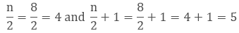
4. 4th term is 8 and the 5th term is 10.
5. So the median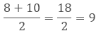
3. Mode
The mode is the value of the observation which shows the number that occurs frequently in data i.e. the number of observations which has the maximum frequency is known as the Mode.
Example
Find the Mode of the following data:
15, 20, 22, 25, 30, 20,15, 20,12, 20
Solution
Here the number 20 appears the maximum number of times so
Mode = 20.
Remark: The empirical relation between the three measures of central tendency is
3 Median = Mode + 2 Mean
QUESTIONS ON STATISTICS
1. If the mean of five observations x, x + 2, x + 4, x + 6, x + 8 is 11, then write the value of x.
ans. 7
2.Determine the mean of first 10 natural numbers.
ans. 5.5
3.Write the class mark of an interval 90 – 120.
ans. 105
4.Find the range of the given data : 25, 18, 20, 22, 16, 6, 17, 15, 12, 30, 32, 10, 19, 8, 11, 20
ans.26
5.Find the median of the values 37, 31, 42, 43, 46, 25, 39, 45, 32.
ans. 39
6.If the median of data (arranged in ascending order) 31, 33, 35, x, x+10, 48, 48, 50 is 40, then find value of x.
ans. 35
7. Find the mode of the following scores : 14, 25, 14, 28, 18, 17, 18, 14, 23, 22, 14, 18
ans. 14
8.The median of the data 26,56,32,33,60,17,34,29,45 is 33. If 26 is replaced by 62, then find the new median.
ans. 34
9. For a particular year, following is the distribution of ages (in years) of primary school teachers in a district:

- Write the lower limit of first class interval.
- Determine the class limits of the fourth class interval.
- Find the class mark of the class 45 – 50.
- Determine the class size. [CBSE March 2018]
10.The class marks of a frequency distribution are 104, 114, 124, 134, 144, 154, 164. Find the class size and class intervals. [CBSE March 2010]
ans. 10
11.Find the mean of the following distribution : [CBSE-14-GDQNI3W]

ans. 19
12.Ten observations 6, 14, 15, 17, x + 1, 2x – 13, 30, 32, 34, 43 are written in ascending order. The median of the data is 24. Find the value of x. [NCERT Exemplar Problem]
ans. 20
13.In figure, there is a histogram depicting daily wages of workers in d factory. Construct the frequency distribution table. (CBSE March 2019)

14.Thirty children were asked about the number of hours they watched TV programmes in the previous week. The results were found as follows :
1 6 2 3 5 12 5 8 4 8 10 3 4 12 2
8 15 1 17 6 3 2 5 9 6 8 7 14 12
(i) Make a frequency distribution table for this data, taking class width 5 and one of the class as 5-10.
(ii) How many children watched television for 15 or more than 15 hours a week? [CBSE March 2018]
15.Given are the scores (out of 25) of 9 students in a Monday test :
14, 25, 17, 22, 20, 19, 10, 8 and 23
Find the mean score and median score of the data. [CBSE 2019]
16.Obtain the mean of the following distribution and also find the mode. [CBSE-2019]

17.In a mathematics test given to 15 students, the following marks (out of 100) are recorded :
41, 39, 48, 52, 46, 62, 54, 40, 96, 52, 98, 40, 42, 52, 60.
Find the mean, median and mode of this data. [CBSE March 2013]
18.The following data given the weight (in grams) of 30 oranges picked from a basket:
106 107 76 109 187 95 125 92 70139 128 100 88 84 99 113 204 141136 123 90 115 110 97 90 107 7580 118 82Construct a grouped frequency distribution table taking class width equal to 20 in such a way that the mid-value of first class in 70.From the frequency table, find the number of oranges(i) weighing more than 180 g.(ii) less than 100 g. [CBSE-2018]
19. The following table gives the pocket money (in Rs) given to children per day by their parents : Represent the data in the form of a histogram. [CBSE2018]

20.Find the mean of children per family from the data given below :
 What values are depicted from this data?

 As in the above figure the no. of observations is 7 i.e. odd, so the median will be

Comments
Post a Comment